

Web part properties are properties that can be defined for a SharePoint Framework (SPFx) web part. These properties can be used to manage the configuration of a web part, such as the title or size of an image. These properties can be defined in the Web Part manifest and can be displayed in the user’s interface for configuring the Web Part. The values of the properties can be stored in the SharePoint object model and can be used to determine the view of the web part.
Go to the .ts file in your webpart’s folder (src\webparts\{webPartName})
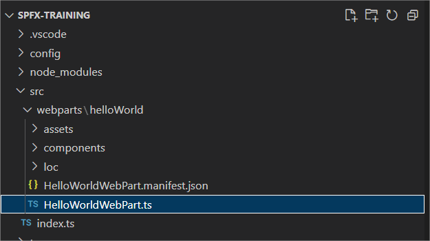
In this .ts file, you will find the getPropertyPaneConfiguration method at the bottom .
    protected getPropertyPaneConfiguration(): IPropertyPaneConfiguration {
      return {
        pages: [
          {
            header: {
              description: strings.PropertyPaneDescription
            },
            groups: [
              {
                groupName: strings.BasicGroupName,
                groupFields: [
                  PropertyPaneTextField('description', {
                    label: strings.DescriptionFieldLabel
                  })
                ]
              }
            ]
          }
        ]
     };
   }

TypeScript
This method consists of the following key issues:
- pages: an array to which you can assign one or more IPropertyPanePage object
- displayGroupsAsAccordion: optional boolean that allows you to specify whether the groups should be displayed as accordion or not
- header: Optional parameter to which you can add an IPropertyPanePageHeader
- Description: Mandatory string belonging to the IPropertyPanePageHeader object
- Image: optional string where you can enter a url for the background image
- groups: mandatory paremeter to which you can assign one or more group of objects (IPropertyPaneGroup or IPropertyPaneConditionalGroup)
- groupName: Optional string parameter where you can give the group a name. It is recommended to make it unique.
- isGroupNameHidden: Optional boolean to specify whether the group name should be displayed in the web part properties
- isCollapsed: Optional boolean to specify whether the group should be collapsed by default or not
- groupFields: Which fields in this group should be visible. Can be one or more IPropertyPaneField objects.
For example, an example of an IPropertyPaneField is a PropertyPaneTextField
                  PropertyPaneTextField('description', {
                    label: strings.DescriptionFieldLabel
                  }

TypeScript
It is important to know that the first value you give is the targetProperty. This means that you can get the value from this.properties followed by the value that you enter as targetProperty. In the above case, you could retrieve the value entered in the text field ‘description’ with this.properties.description. You can then pass this value to your underlying React component and then send your webpart according to the value of this property.
    public render(): void {
      const element: React.ReactElement<IHelloWorldProps> = React.createElement(
         HelloWorld,
         {
           description: this.properties.description
         }
      );

      ReactDom.render(element, this.domElement);
    }

TypeScript
When the webpart is deployed to SharePoint, anyone who has the rights to edit the page can also change the web part properties of the webpart (which is on that page). For the webpart we just created, these in production look like this:

 Nico De Cleyre